Why Your Prints Might Look Different Than You Expected
It is one of the most common messages we get: a customer opens their box of prints, holds them next to the photo on their phone, and feels like something is missing. The colors seem flatter. Less punchy. A little washed out. Almost every time, the print is accurate — and the phone is the one exaggerating things.
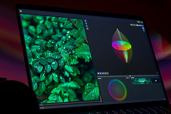
Phones Are Built to Make Photos Look Vivid
Phone screens are backlit, and manufacturers tune them deliberately to display images brighter and more saturated than the file actually is. That is part of the design — it is what makes photos look sharp and alive scrolling through your camera roll. It is also, in a sense, a kind of built-in filter you may not realize is there.
A print is not backlit. It is reflective, which means how it looks depends on the ambient light in the room where you view it, not a glowing screen behind the image. A print will never have that same glow a phone gives you — and it is not supposed to. What we aim for with every order is a print that matches your original file as closely as possible, evaluated on a professionally color-calibrated monitor. That is a far more accurate reference point than a backlit phone screen tuned for maximum vibrancy.
What Our Color Correction Service Actually Covers
Color correction at Yellow Lab Imaging is $1 per image, and it is a technical review, not a style makeover. Specifically, it covers:
- Resolution verification — making sure your file has enough detail for the size you ordered.
- Exposure — correcting files that are too dark or too bright.
- Density — fine-tuning depth and tonal range for good contrast.
- Color balance — removing unwanted color casts so skin tones and neutrals look natural.
Every file gets this review, whether or not it ends up needing changes. If your file needs adjustment, we make it by hand before it goes to print. If it is already clean, it prints exactly as submitted. Either way, the fee covers the same thing: a real person looking closely at your image before it becomes a print.
What Color Correction Does Not Cover
Here is the piece that catches people off guard: color correction does not automatically make colors more vibrant or saturated. That is a stylistic choice, and it is a genuinely subjective one — not everyone wants their photos punched up the way a phone screen does it. Some customers want their prints to look exactly like a true, faithful copy of the file. Others want that extra vibrancy dialed back in.
Because taste varies so much, we do not apply a vibrancy boost automatically. If you want it, tell us. A quick note in the checkout notes section is all it takes, and we will build the extra saturation and vibrancy into your color correction pass before we print.
Further Reading
Why Color Correction Is Worth It
Think of color correction as a kind of insurance for your order. Every file takes real time to review properly — checking resolution, evaluating exposure and color balance, and making adjustments by hand when something is off. That time is the same whether your file needs one correction or none at all, which is why the fee is consistent either way.
If you accept color correction and something still does not look right once it is printed, we stand behind the work and will make it right. If color correction is declined, your file is printed exactly as submitted, and we are not able to offer a free reprint for color-related concerns, since there was no chance to review the file beforehand.
Getting the Color You Want, Every Time
The simplest way to make sure your prints match what you have in mind is to tell us up front. If you love the vivid, high-contrast look your phone gives your photos, say so in the checkout notes — we are glad to bring that same energy to your prints. If you would rather have a true-to-file, natural look, that is exactly what standard color correction already gives you. Either way, a print you are happy with starts with us knowing what you are picturing.
Questions about your order, your files, or which finish is right for your photos? Contact us or call 913.217.7202 — a real person will answer.
Related Yellow Lab Imaging Services
Learn more about our color correction service, browse our photo prints online, or order 3x3 photo prints and mini photo prints.